Where It All Started
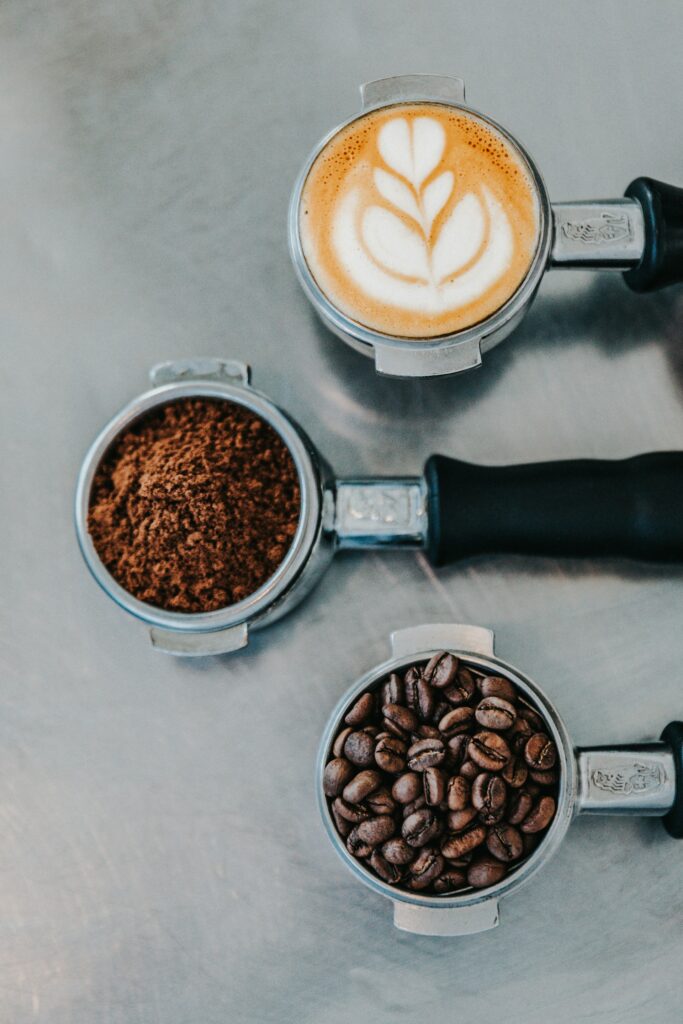
I don’t think of coffee as just a drink in Colombia. It’s a whole way of living. Tangled up with warmth, hospitality, and highland views that never quite get old. When I sit down to build the brand identity for my Colombian-inspired coffee shop, honestly, the one thing I care about most is that it feels true, not staged. So I put the obvious stuff aside. Flags, bright primary colors, stock-photo coffee beans , none of that makes the cut. Instead, I go chasing something more modern, more elevated. Ultimately, I want something that comes from the culture, not a cliché of it.
A Palette Inspired by Colombia
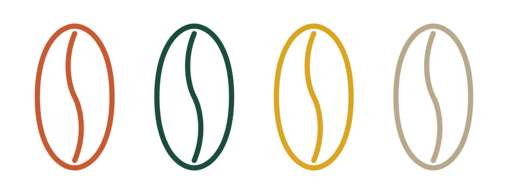
As always, I start with color. First, I skip anything loud. Then, I land on four shades that each carry a piece of the story:
- Terracotta (#C85A32) — I think of the sun-baked clay roof tiles scattered across Andean villages
- Emerald Green (#1B4D3E) — I picture the thick, almost overwhelming greenery of the high-altitude coffee valleys
- Warm Ochre (#DAA520) — I pull this straight from the natural fibers of hand-woven aguadeño hats
- Soft Cream (#FDFBF7) — I use this as a calm, clean base so everything else can breathe
Designing the Logo
For the logo, I keep coming back to one idea: minimal, clean lines, nothing fussy. Eventually, I end up blending the silhouette of a wax palm tree with the curve of a coffee droplet. Then I pair it with a refined serif typeface. Because I build it all on simple vector geometry, it holds up whether it’s embroidered on an apron or stamped onto a paper sleeve.
What This Project Teaches Me
If there’s one thing I take away from this project, it’s this: I don’t need to shout to make cultural branding strong. In fact, real authenticity rarely comes from loud, obvious symbols. More often, it’s hiding in the quieter stuff, textures, landscapes, memories. So my job is simply to weave them into something people actually feel.
Even the small decisions here are made on purpose. After all, that’s really the difference between a logo and a story.
Let’s Talk About It
So I’ll ask you this: what stands out to you the most? Meanwhile, I’d love to hear your thoughts in the comments. And come follow along on Instagram @isabellx.designs to watch this whole concept come to life.
Leave a Reply