Second Semester
Overview
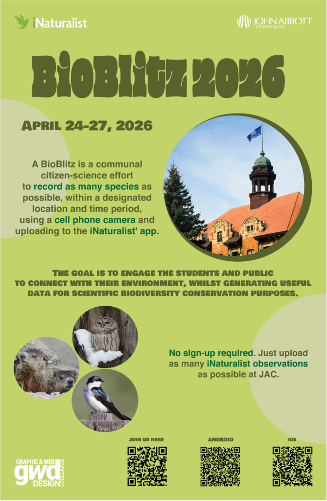
Project: BioBlitz 2026 – Event Poster for the John Abbott College Community.
Goal: To design an 11 x 17 in. portrait poster that invites students and the public to become citizen-scientists by joining the JAC BioBlitz, April 24-27, 2026. Participants use their phone cameras and the iNaturalist app to record as many living things (plants, animals, fungi) as possible on the JAC campus. Together, the photos create a snapshot of the campus’s biodiversity, and they provide useful data for science and conservation. No sign-up is required, so the poster has to make the event feel easy and welcoming.
What a BioBlitz is: A community effort to record as many species as possible within a set place and time period.
Requirements
- Headline: “BioBlitz 2026”
- Date: April 24-27, 2026
- Short body copy explaining the event and how to take part
- Logos: iNaturalist, JAC, and GWD (with the design credit
in Roboto). - QR codes: the JAC BioBlitz info page, the iNaturalist app (Apple and Android), and the Campus Biodiversity Network page.
Working File
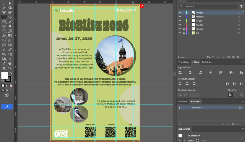
Adobe Illustrator 2026
Rationale
I designed this poster to invite the John Abbott community to join the BioBlitz, my main goal was that a passerby could understand the event at a glance and know exactly what to do. To achieve this, I prioritized hierarchy, contrast, and proximity across all the elements: the headings, pictures, text, and QR codes.
Hierarchy
I arranged the information in order of importance so the eye moves through the poster naturally: first the headline and date, then the explanation of the event, and finally the practical details (QR codes and logos). Differences in size, weight, and placement tell the viewer what to read first, second, and third, instead of everything competing for attention.
Typography and contrast
I used Helvetica Bold for the body text and Bowlby One SC for my heading 2. Even though the poster contains a lot of bold text, I deliberately used three different typefaces to create contrast between levels of information. Bowlby One SC is heavy and has a strong personality, so it stands out and signals a new section, while Helvetica Bold is clean and neutral, which keeps the body copy easy to read. The contrast between the typefaces, rather than only changes in size, helps readers’ eyes follow the information in the right order.
Proximity
I grouped related elements together so the poster reads in clear sections. For example: each QR code sits next to its label, the logos and design credit are grouped, and the photos are placed near the text they support. Using white space to separate the groups prevents the layout from feeling crowded and makes each piece of information easier to find.
Grid system and alignment
I built the layout on a grid system to keep it consistent and organized. The grid aligns the text, images, and QR codes to the same columns and margins, which gives the poster a clean, intentional structure and keeps the page balanced even with many elements.
Overall
Together, these choices make the poster clear, organized, and easy to scan. Viewers quickly understand what a BioBlitz is, when it happens, and how to take part.
Final Result