Second Semester
Overview
Project: Print Redesign: [poster / flyer / menu / brochure]
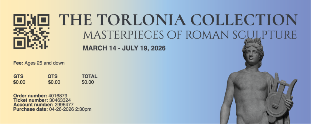
Goal: To redesign an existing print piece to improve its clarity, effectiveness, and visual communication. I identified the weaknesses of the original and applied hierarchy, contrast, alignment, and proximity to create a stronger, more intentional solution. The project was done in a simulated client relationship, with my instructor as the client.
Requirements
- Hierarchy
- Contrast
- Alignment
- Proximity
- Typography
- Color Palette
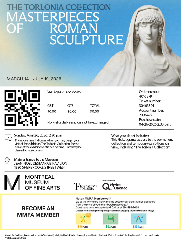
During my second semester in Graphic and Web Desing program, I redesigned this piece to demonstrate design elements and principles by improving hierarchy, proximity, contrast, and alignment. I turned a cluttered/unclear original digital version into a clean, cohesive print design that communicates its message effectively. This project was inspired by The Torlonia Collection at the Montreal Museum of Fine Arts in April 2026.
Assets
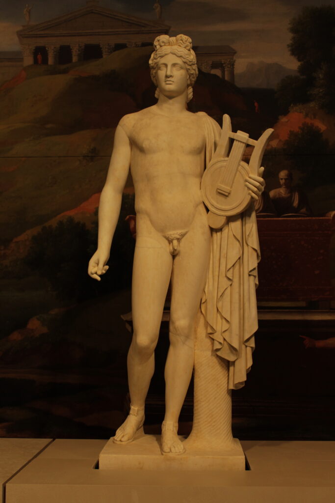
Original Picture from
the Montreal Museum of Fine Arts
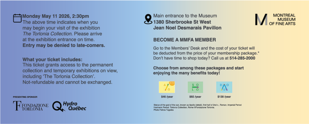
Original Museum Ticket
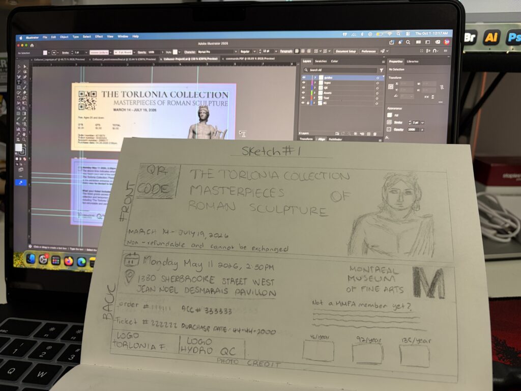
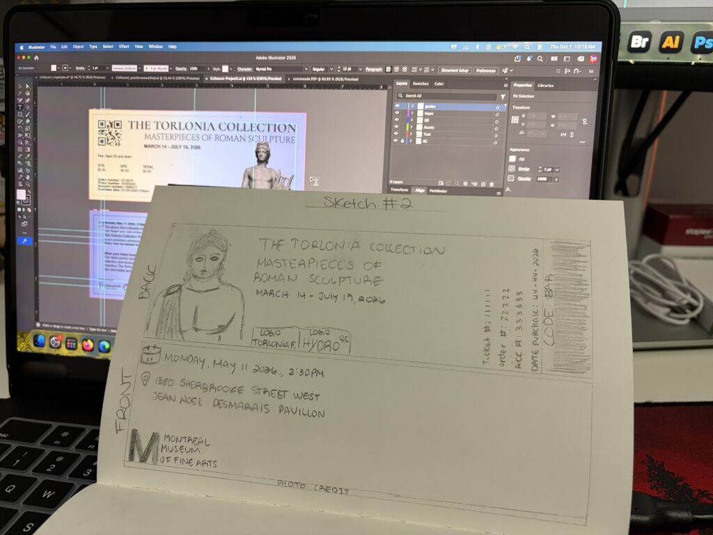
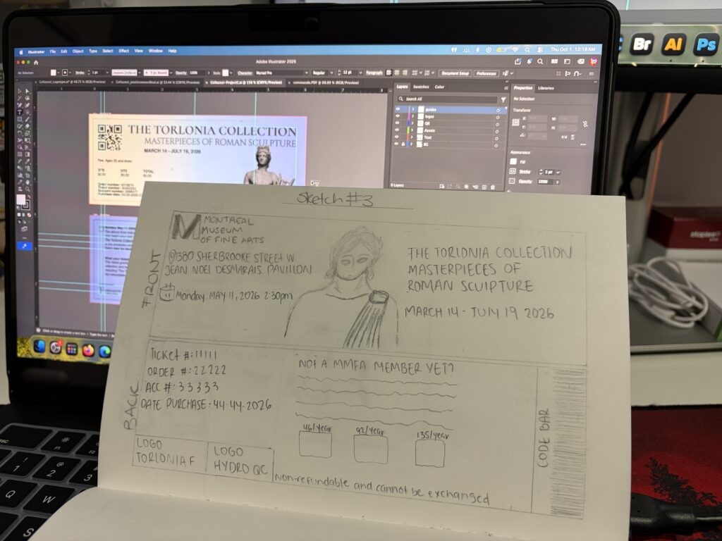
Sketch Ideas
Sketch #1
Sketch #2
Sketch #3
Layout
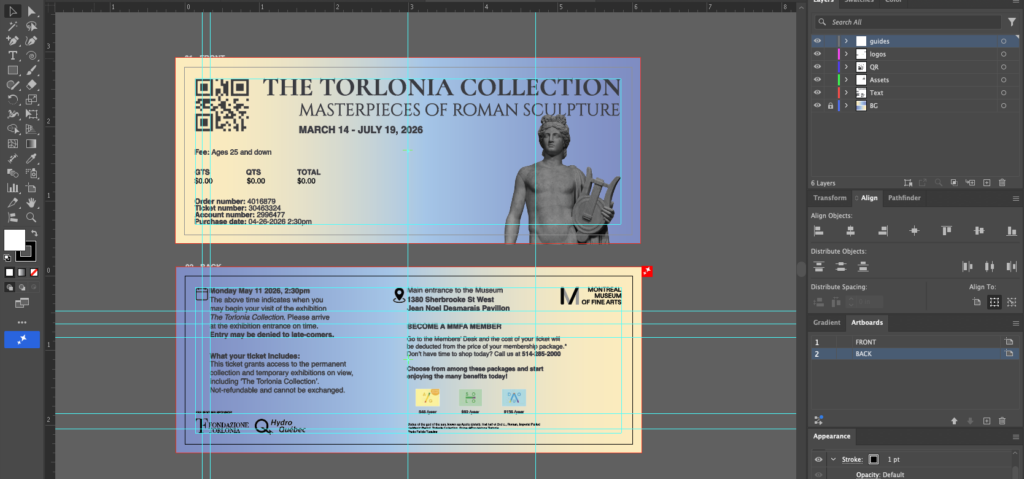
Adobe Illustrator 2026
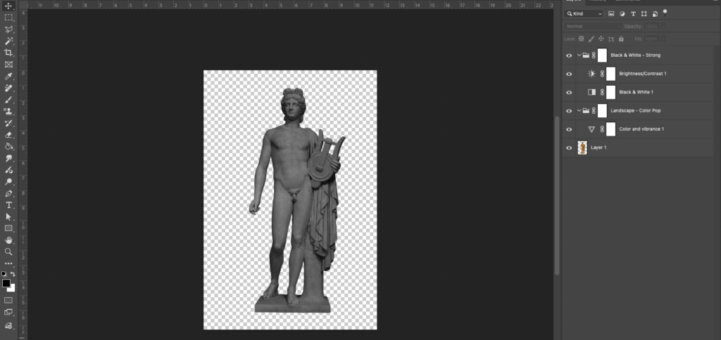
Adobe Photoshop 2026
Rationale
For this project, I redesigned the digital ticket of the Montreal Museum of Fine Arts as a print version. I chose it because I felt the digital ticket lacked hierarchy, contrast, and alignment: the information all had a similar weight, so it was hard to know what to read first. Because this is a fine arts museum, I also expected a more creative layout, one that reflects the artistic experience the visitor is about to have, and I wanted my redesign to deliver that.
Photography
What helped me the most was going to the collection in person and taking my own photographs of the Roman sculptures. Working with first-hand images gave the ticket an authentic connection to the exhibition, and it let me control the framing, lighting, and detail of the pieces instead of relying on existing images.
Typography and hierarchy
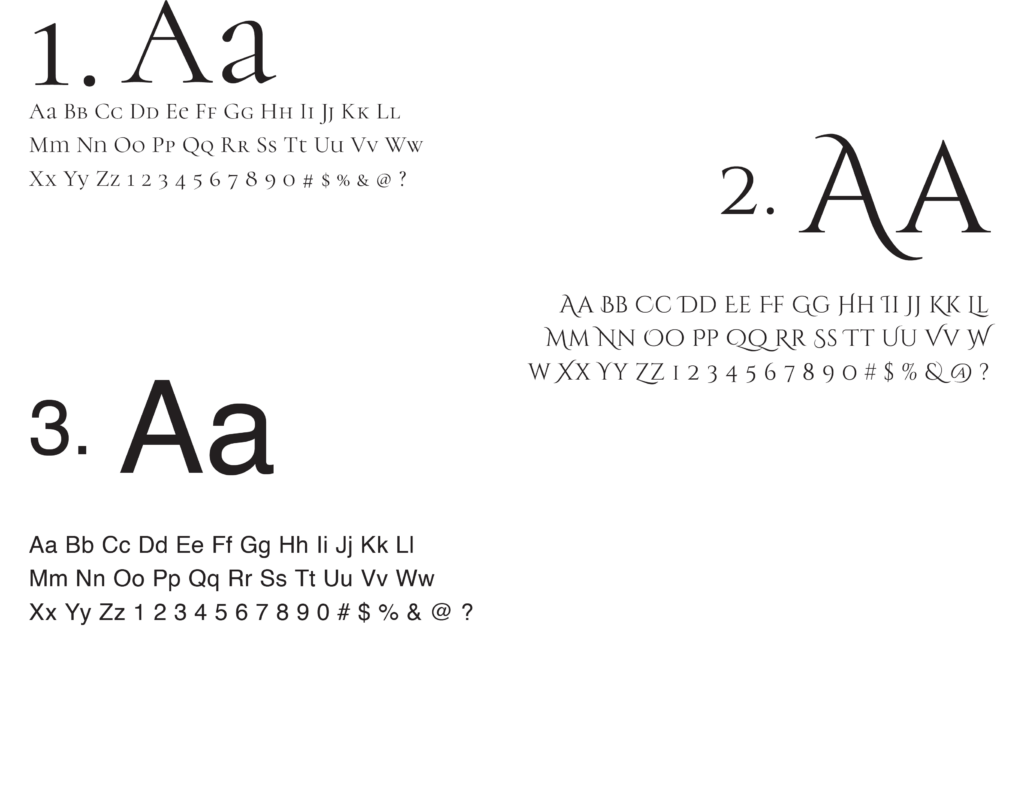
I chose three typefaces to separate the levels of information:
1. Cormorant Unicase for my heading 1. It is a serif typeface that expresses the elegance and seriousness of the collection, and it makes the title the clear starting point of the ticket.
2. Cinzel Decorative for my heading 2. Its classical, Roman-inspired letterforms echo the theme of the sculptures and add a decorative touch while still supporting the main title.
3. Helvetica Regular and Bold for my body text. This clean, neutral sans serif is easy to read at small sizes, and using the bold weight lets me emphasize key details (like dates and times) without adding another typeface.
The pairing of expressive serif headings with a simple sans-serif body creates strong contrast and a clear hierarchy.
Alignment and proximity
I paid close attention to text alignment and the overall page layout so the information follows a clear structure. Related details are grouped close together, and different groups are separated with space, which makes the ticket organized and quick to scan.
Logos and QR code
I integrated the Hydro-Québec, Torlonia Foundation, and Montreal Museum of Fine Arts logos so that the partners and the institution are properly represented without competing with the main content. I decided to keep a QR code instead of a barcode because it feels more modern and takes up less space, which leaves more room for the layout and imagery.
Overall
I had a lot of fun with this project because I felt a lot of freedom in choosing my color palette, fonts, text alignment, and overall layout. In the end, I prioritized hierarchy, alignment, contrast, and proximity to turn a flat, hard-to-read digital ticket into a print piece that is clear, elegant, and worthy of a fine arts museum.
Typography Choices
Final Results
BACK
FRONT COVER