Second Semester
Overview
Project: Typographic Stickers, final project for Typography class.
Goal: Design a set of stickers built entirely around letterforms, in three different typographic styles: Graffiti/Tag, Monogram, Illustrated Capitals; then prepare and print them as a sheet.
Requirements
Graffiti / Tag – Minimum 3:
Expressive, hand-drawn or street-inspired lettering with energy, flow, and personality.
Monogram – Minimum 3:
Initials or letters combined into one compact mark, with attention to how the letters interlock, overlap, or share space.
Illustrated capitals – Minimum 3:
Decorative capital letters with illustration built into or around them (patterns, objects, characters, textures).
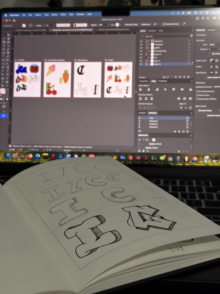
Sketch Ideas
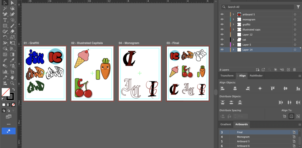
Working File
Adobe Illustrator 2026
Rationale
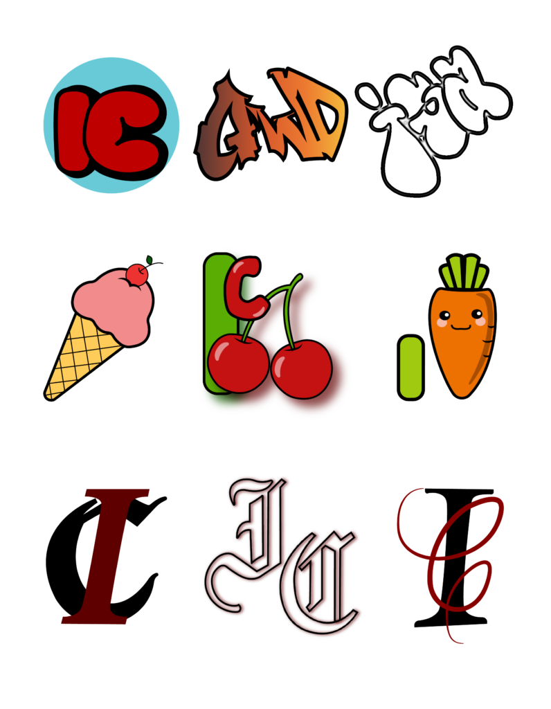
My graffiti stickers were inspired by the Chicano lettering style and by the display fonts I see regularly while walking around the city, on signs, storefronts, and street art.
I explored three directions:
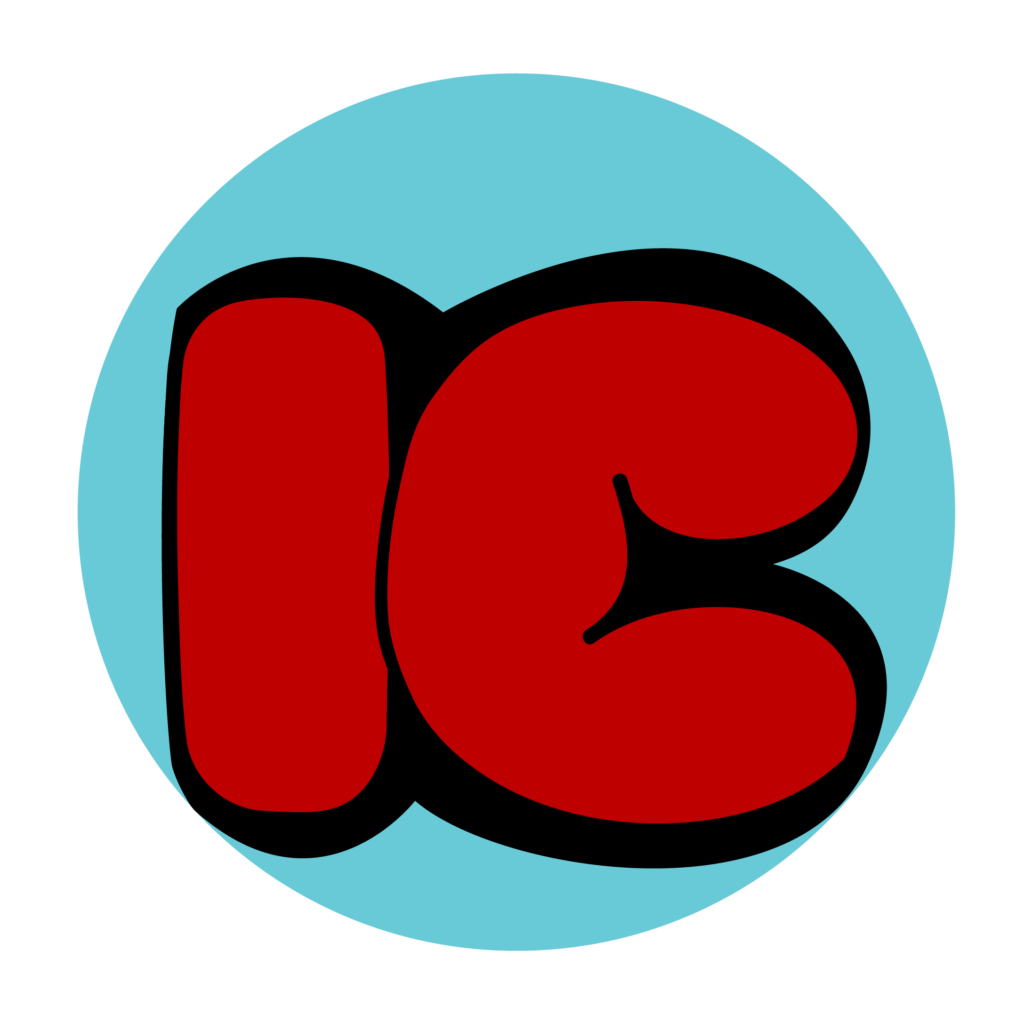
“IC” (rounded): I used soft, rounded shapes with thick strokes to create a friendly, bubbly feel.
The curves keep the letters flowing together, and the heavy weight makes them read well at a small size.
“Isa” (playful): I decided to just keep the outline thin and without fill color to make it more personal and energetic.
The outline color is metallic, it gives contrast and stands out from the other designs.
“GWD” (old school): For this one I went for a more classic, old-school graffiti look, with bold outlines and sharper angles. It contrasts with the rounded “IC” and shows a different side of the same style.
For the illustrated capitals, my main goal was instant recognition: the viewer should see the capital letter first and then discover the illustration. I did this by building the illustration directly from the shape of the letter. For example, in my ice cream design, the ice cream forms the I for my initial. I applied the same concept to other designs, such as the carrot and the cherry. Choosing simple, familiar objects made the concept easy to understand, and the bright colors help each object stand out and be recognized from a distance.
For the monograms, I chose a more elegant and refined direction. I used serif letterforms and drew inspiration from Old English (blackletter) typefaces and script typefaces. The contrast between thick and thin strokes gives these designs a classic, formal feel. The monograms are compact, with the letters interlocking or overlapping, and the more limited color palette of red and black reinforces the sense of elegance. This style contrasts on purpose with the playful energy of the graffiti stickers.
Final Results